Exploratory Data Analysis - Energy Pricing in Australia
The following project shows how Exploratory Data Analysis (EDA) can be applied to an electricity usage data set. The project is created using Python within the Jupyter Notebook environment, including packages Pandas, Numpy, Matplotlib and Seaborn.
Background
The National Energy Market (NEM) is the wholesale framework that generators and retailers use to trade electricity in Australia. We typically have the generators selling electricity to the retailers at a market price which is updated every hour. The retailers then hedge against the market, to distribute electricity to the consumers at a static price.
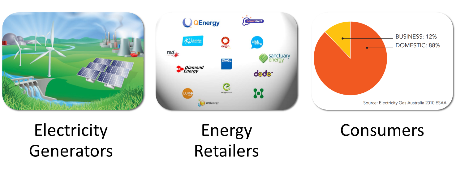
The marketplace uses an auction based system to allow generators to adjust prices when demand changes (peak hours), and/or when supply fluctuates (solar or renewables are limited).
Extremely large consumers can bypass the retailers and purchase electricity directly from the generators at the market price. It is these large consumers that have the opportunity to manage their electricity usage to provide monetary savings. For example
- Load Shedding - Spreading electrical use over a longer period of time to avoid peak prices
- Demand Management - Using electricity only when the price is low
- Energy storage - Storing energy through mechanisms such as batteries, pumped hydro or therma when prices are low and using the storage when prices are high.
Alcoa - Portland Aluminium Smelter
For this case study, we use the hypothetical example of the Alcoa Portland Aluminum Smelter in Victoria, Australia, and frame the data analysis as a business question;
How can Alcoa’s Portland Aluminum smelter use demand management to reduce its energy costs?
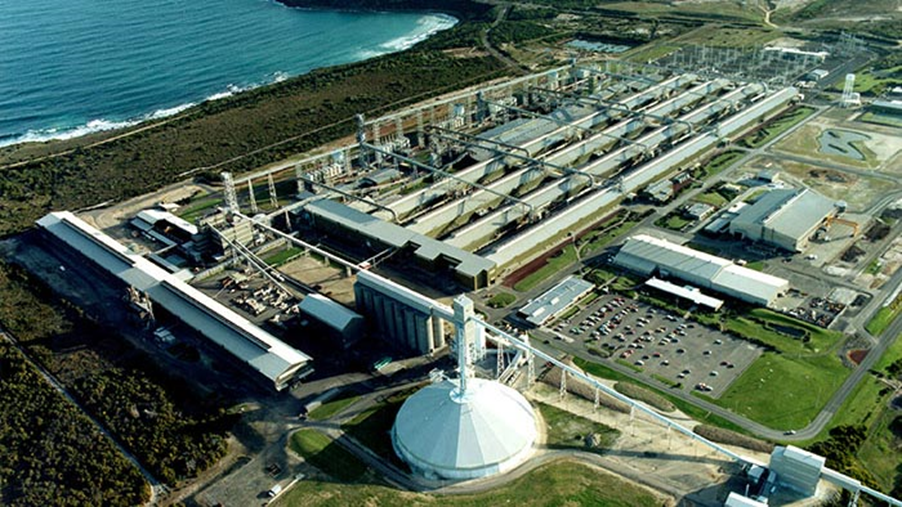
The aluminum smelter uses up to 10% of Victoria's total electricity demand, can purchase directly from generators and can typically use the following strategies to reduce electricity costs
- Use electricity when prices are low (solar and wind generation is at its peak)
- Shut down processes when energy is expensive (during peak demand hours)
Dataset
The data set is taken from the Daily Electricity Price and Demand Data - Alex Kozlov (Kaggle)
https://www.kaggle.com/datasets/aramacus/electricity-demand-in-victoria-australia
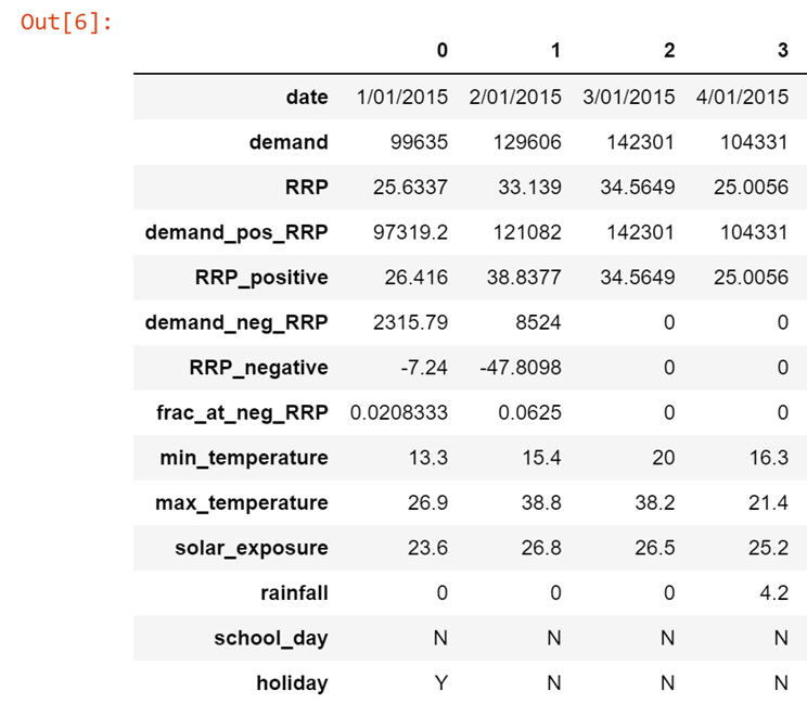
It includes the total Daily Electricity Demand (MWh) in Victoria between 1st January 2015 and 6th October 2020 with the following features
Data Preparation and Cleaning
Data preparation and cleaning is first applied to the dataset
- Convert Date to date/time
- Take subsets of data -2015-2019 and 2019 only
- Remove redundant features
- Remove outliers (RRP)
Visualizations
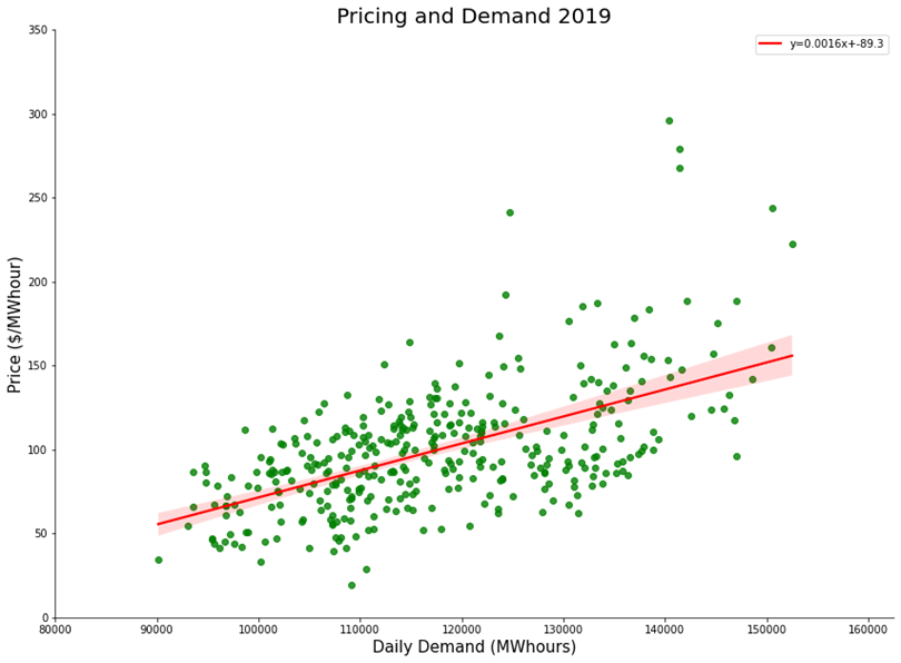
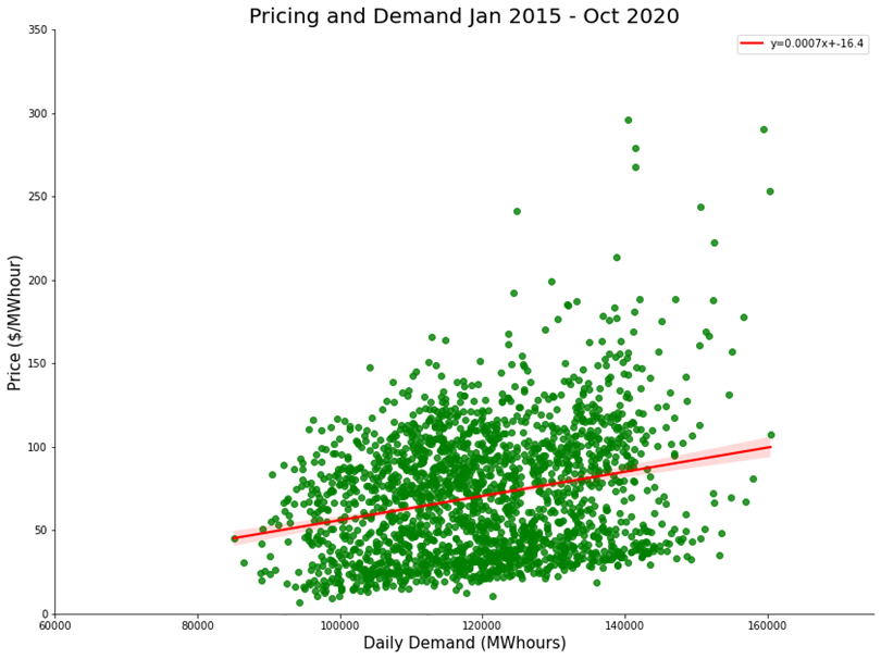
First up we create a scatter plot to see how the price of electricity prices change with demand. There is a strong positive correlation, which is to be expected.
Max/Min Temperature and Demand
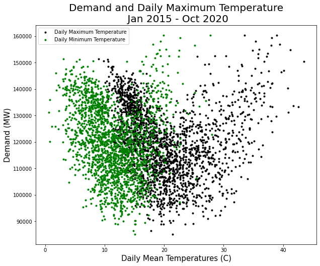
We can also create scatter plots that show how the electricity demand changes depending on the max/min daily temperatures. Interestingly we can see peaks at both high and low temperatures, and reduced demand at the milder temperatures at the center of the data charts.
School Days
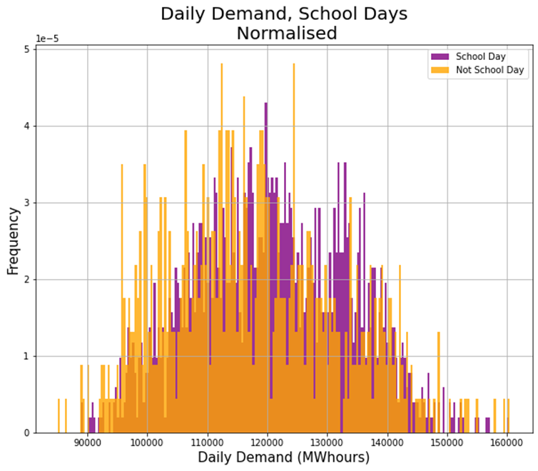
After normalizing the data to account for there being more school days in our sample. We plot a histogram of the typical daily demand on school days versus non school days. We can derive the following from the chart
- Higher Daily Demand on School Days
- Median Daily Demand for School Day = 120,718 MWhours
- Median Daily Demand for Non-School Day = 116,297 MWhours
Holidays
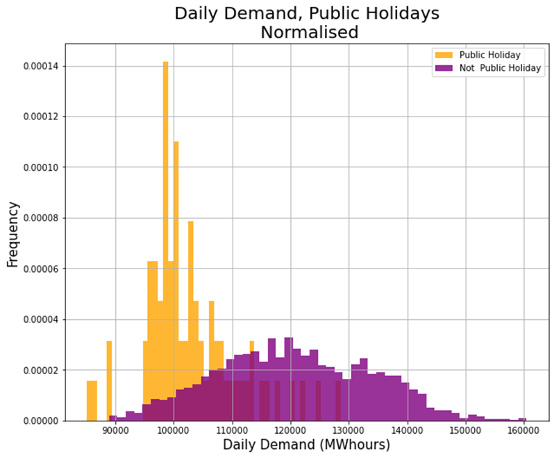
Similarly after normalizing our data to account for less public holidays we plot a histogram for usage on public vs non-public holidays;
- Significantly Lower Daily Demand on public holidays
- Median Daily Demand for Public Holiday = 100,696 MWhours
- Median Daily Demand for Non-School Day = 120,086 MWhours
Solar Index
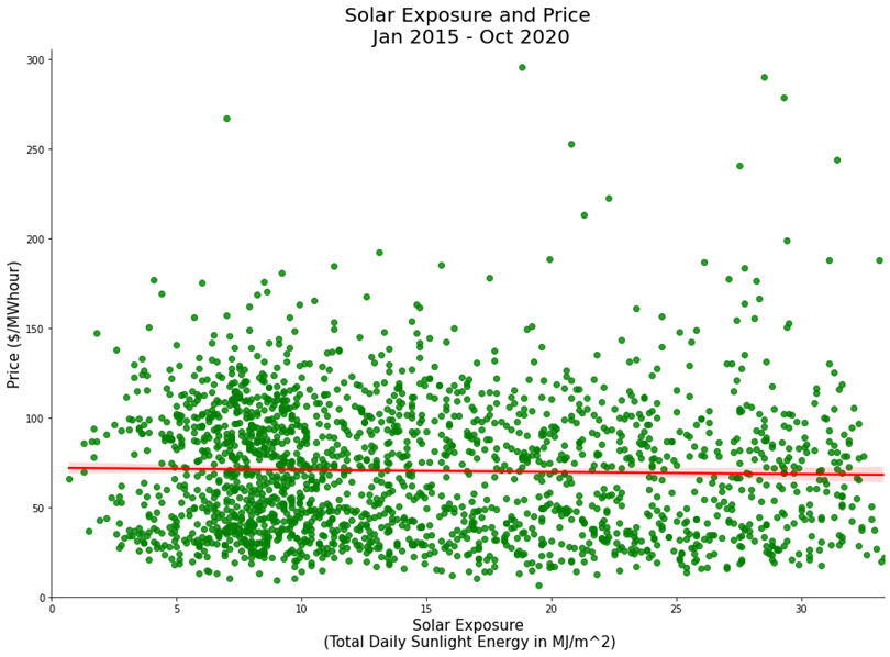
We speculated that a higher solar index would correlate with lower prices due to excessive solar supply. However there is no visible correlation between solar index and price
Conclusions
- Electricity prices increase with higher demand
- Electricity demand increases at peak minimum and maximum temperatures
- Demand is lower on weekends and public holidays
- There is no significant correlation between solar index and pricing
References
https://www.kaggle.com/datasets/aramacus/electricity-demand-in-victoria-australia
Alex Kozlov - Daily Electricity Price and Demand datas
Github
The code for this project can be found on my Github
Exploratory Data Analysis - Energy Pricing in Australia